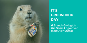
It’s Groundhog Day: 6 Brands Giving Us the Same Logo Over (and Over) Again
When a weatherman, Phil, is reluctantly sent to cover a story about a forecasting “rat” (as he calls it), he makes no effort to hide his annoyance. The next day he discovers that it’s Groundhog Day again, and again, and again… Just as Phil wakes up to the same Sonny & Cher song, people, and experiences each day, these six brands have continued to market the same logo to consumers for years (sometimes decades) on end.
Of course, there are many reasons to choose not to rebrand. First and foremost, if the existing design is popular and sales are strong, there’s really no reason for the financial investment. However, some designs are noticeably outdated. Consumers can tell the era it was intended for by the serifs, colors, and dimensions. Like having the same conversations and reporting on the shadow of the same groundhog, consumers can begin to feel complacent.
This is also a great opportunity for agencies to reach out. Those who subscribe to WinmoEdge can be alerted to brands in our Vulnerable Account Index (VAI). We track signs that an agency review is coming such as a new CMO or dramatic increases or decreases in specific advertising spending. These important alarms, plus a seven-year, or older, logo, signal an awesome opportunity for creative experts to reach out and propose a new logo/subsequent branding campaign.
Here are six brands giving us the same logo over and over again.
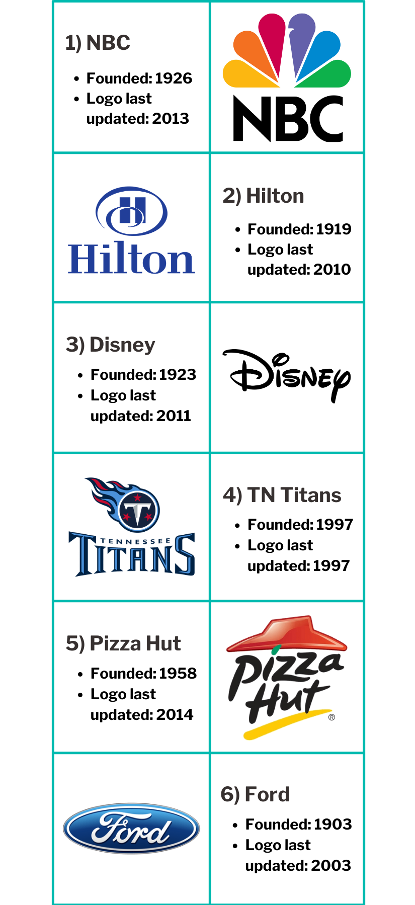
This isn’t all to say that brands should focus on being trendy and revamp their logos every five years. Not at all. Instead, it’s best to choose a contemporary look that’s instantly recognizable. A very heavy task. Yet, many forward-thinking companies have broken the Groundhog Day-cycle and freshened up their branding.
Agencies, take note. Here are four ways stale logos and branding can be updated to avoid being jolted awake by “I’ve Got You, Babe” in Punxsutawney, PA:
1) Scaled-back aesthetics
Some brands have simplified like Popeyes, BMW, and Tripadvisor. Others have flattened their design like Taco Bell, Airbnb, and Google. With the chaos of 2020, brands must invoke a sense of calm, understanding, and positivity.
2) Classic fonts
The most important movements of the 20th century in graphic design are always the inspiration for the best designers. Classic sans serif styles are always current. Plus, by following the rules imposed by them it’s almost impossible to make mistakes.
3) Motion logos
Motion, in the form of a GIF, is an easy way to add modernity to your logo and make it look presentable in the upcoming year. eBay and Paypal have done a great job implementing this option.
4) Gradients
These are gaining in popularity because they provide more room for creativity and create a sense of movement. Some almost feel like animation, yet gradients can still be used as part of a minimalistic design.

